Note
Go to the end to download the full example code.
Plot Model Components
Plotting power spectrum model parameters and components.
# Import the FOOOFGroup object
from fooof import FOOOFGroup

# Import utilities to manage frequency band definitions
from fooof.bands import Bands
from fooof.analysis import get_band_peak_fg

# Import simulation utilities for making example data
from fooof.sim.gen import gen_group_power_spectra
from fooof.sim.params import param_jitter

# Import plotting function for model parameters and components
from fooof.plts.periodic import plot_peak_fits, plot_peak_params
from fooof.plts.aperiodic import plot_aperiodic_params, plot_aperiodic_fits
Experiment Set Up & Simulate Data
In this example, we will explore the plotting functions available to visualize model parameters and components from fitting power spectrum models.
To do so, we will consider a hypothetical experiment in which we are compare power spectrum models between two groups of participants, and so we want to visualize differences between the groups. For simplicity, we will consider that we have one ‘grand average’ power spectrum per subject, which we can compare and visualize.
# Set up labels and colors for plotting
colors = ['#2400a8', '#00700b']
labels = ['Group-1', 'Group-2']
# Set the number of 'subjects' per group
n_subjs = 20

# Define the frequency range for our simulations
freq_range = [1, 50]

# Define aperiodic parameters for each group, with some variation
g1_aps = param_jitter([1, 1.25], [0.5, 0.2])
g2_aps = param_jitter([1, 1.00], [0.5, 0.2])

# Define periodic parameters for each group, with some variation
g1_peaks = param_jitter([11, 1, 0.5], [0.5, 0.2, 0.2])
g2_peaks = param_jitter([9, 1, 0.5], [0.25, 0.1, 0.3])
# Simulate some test data, as two groups of power spectra
freqs, powers1 = gen_group_power_spectra(n_subjs, freq_range, g1_aps, g1_peaks)
freqs, powers2 = gen_group_power_spectra(n_subjs, freq_range, g2_aps, g2_peaks)
Fit Power Spectrum Models
Now that we have our simulated data, we can fit our power spectrum models, using FOOOFGroup.
# Initialize a FOOOFGroup object for each group
fg1 = FOOOFGroup(verbose=False)
fg2 = FOOOFGroup(verbose=False)
Plotting Parameters & Components
In the following, we will explore two visualization options:
plotting parameter values
plotting component reconstructions
Each of these approaches can be done for either aperiodic or periodic parameters.
All of the plots that we will use in this example can be used to visualize either one or multiple groups of data. As we will see, you can pass in a single group of parameters or components to visualize them, or pass in a list of group results to visualize and compare between groups.
You can also pass in optional inputs labels and colors to all the following functions to add plot labels, and to set the colors used for each group.
Periodic Components
First, let’s have a look at the periodic components.
To do so, we will use the Bands object to store our frequency
band definitions, which we can then use to sub-select peaks within bands of interest.
We can then plot visualizations of the peak parameters, and the reconstructed fits.
# Extract alpha peaks from each group
g1_alphas = get_band_peak_fg(fg1, bands.alpha)
g2_alphas = get_band_peak_fg(fg2, bands.alpha)
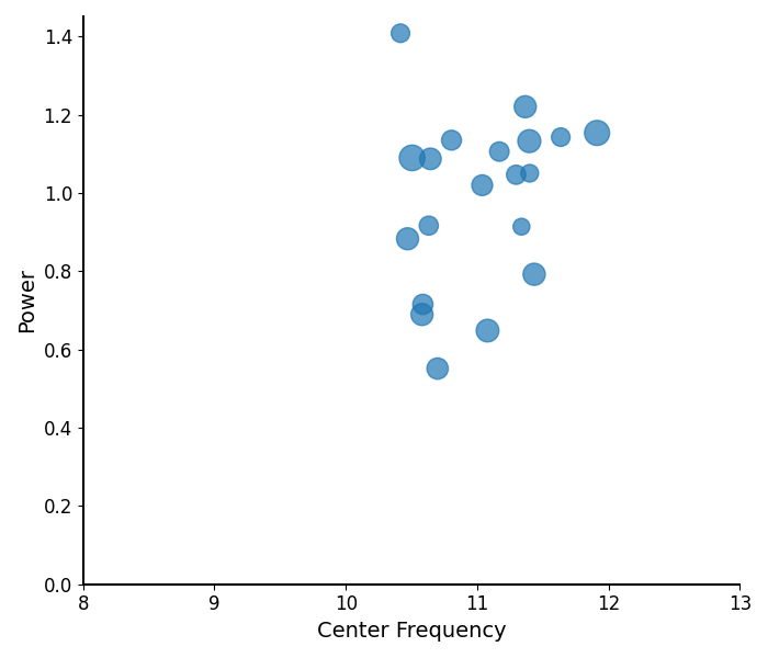
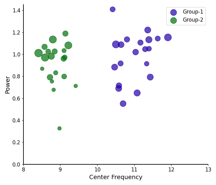
Plotting Peak Parameters
The plot_peak_params() function takes in peak parameters,
and visualizes them, as:
Center Frequency on the x-axis
Power on the y-axis
Bandwidth as the size of the circle
# Explore the peak parameters of Group 1's alphas
plot_peak_params(g1_alphas, freq_range=bands.alpha)
# Compare the peak parameters of alpha peaks between groups
plot_peak_params([g1_alphas, g2_alphas], freq_range=bands.alpha,
                 labels=labels, colors=colors)
/Users/tom/opt/anaconda3/lib/python3.8/site-packages/fooof/plts/style.py:71: MatplotlibDeprecationWarning: The legendHandles attribute was deprecated in Matplotlib 3.7 and will be removed two minor releases later. Use legend_handles instead.
  for handle in legend.legendHandles:
/Users/tom/opt/anaconda3/lib/python3.8/site-packages/fooof/plts/style.py:71: MatplotlibDeprecationWarning: The legendHandles attribute was deprecated in Matplotlib 3.7 and will be removed two minor releases later. Use legend_handles instead.
  for handle in legend.legendHandles:
/Users/tom/opt/anaconda3/lib/python3.8/site-packages/fooof/plts/style.py:71: MatplotlibDeprecationWarning: The legendHandles attribute was deprecated in Matplotlib 3.7 and will be removed two minor releases later. Use legend_handles instead.
  for handle in legend.legendHandles:
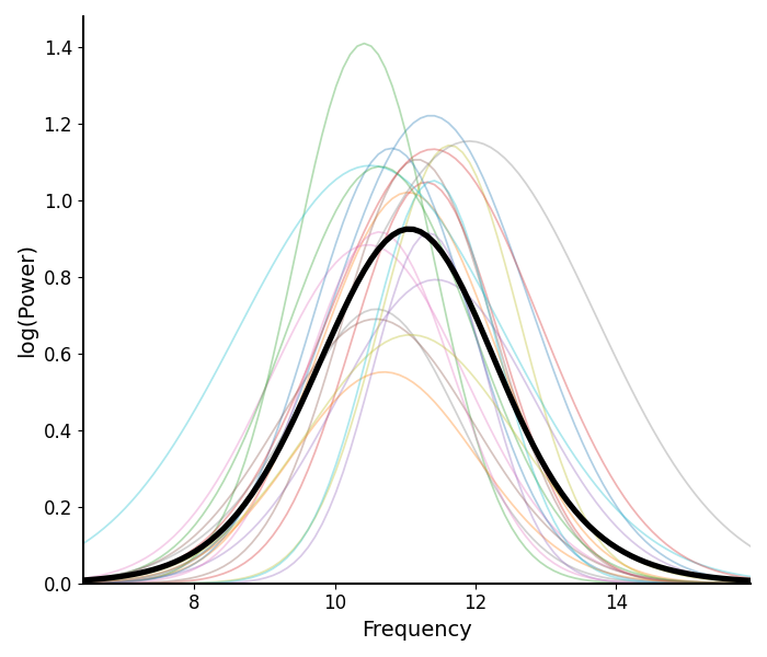
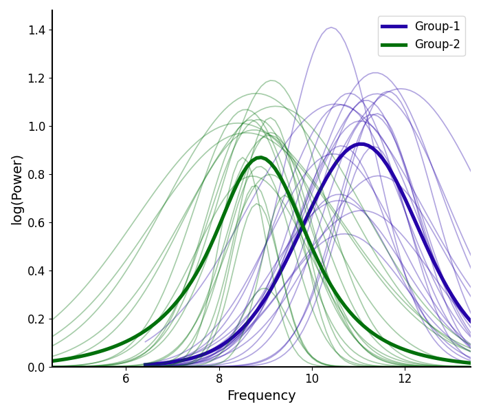
Plotting Peak Fits
The plot_peak_fits() function takes in peak parameters,
and reconstructs peak fits.
# Plot the peak fits of the alpha fits for Group 1
plot_peak_fits(g1_alphas)
# Compare the peak fits of alpha peaks between groups
plot_peak_fits([g1_alphas, g2_alphas],
               labels=labels, colors=colors)
/Users/tom/opt/anaconda3/lib/python3.8/site-packages/fooof/plts/style.py:71: MatplotlibDeprecationWarning: The legendHandles attribute was deprecated in Matplotlib 3.7 and will be removed two minor releases later. Use legend_handles instead.
  for handle in legend.legendHandles:
/Users/tom/opt/anaconda3/lib/python3.8/site-packages/fooof/plts/style.py:71: MatplotlibDeprecationWarning: The legendHandles attribute was deprecated in Matplotlib 3.7 and will be removed two minor releases later. Use legend_handles instead.
  for handle in legend.legendHandles:
/Users/tom/opt/anaconda3/lib/python3.8/site-packages/fooof/plts/style.py:71: MatplotlibDeprecationWarning: The legendHandles attribute was deprecated in Matplotlib 3.7 and will be removed two minor releases later. Use legend_handles instead.
  for handle in legend.legendHandles:
Aperiodic Components
Next, let’s have a look at the aperiodic components.
# Extract the aperiodic parameters for each group
aps1 = fg1.get_params('aperiodic_params')
aps2 = fg2.get_params('aperiodic_params')
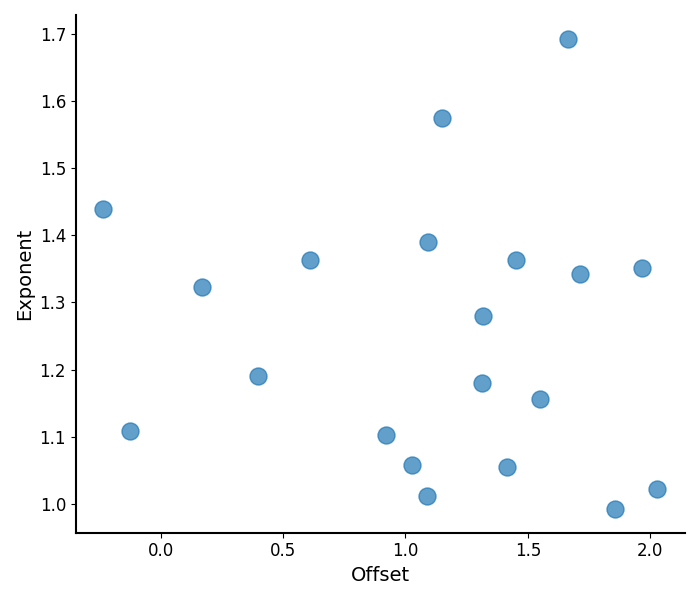
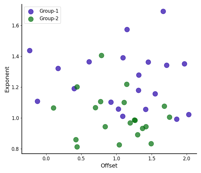
Plotting Aperiodic Parameters
The plot_aperiodic_params() function takes in
aperiodic parameters, and visualizes them, as:
Offset on the x-axis
Exponent on the y-axis
# Plot the aperiodic parameters for Group 1
plot_aperiodic_params(aps1)
# Compare the aperiodic parameters between groups
plot_aperiodic_params([aps1, aps2], labels=labels, colors=colors)
/Users/tom/opt/anaconda3/lib/python3.8/site-packages/fooof/plts/style.py:71: MatplotlibDeprecationWarning: The legendHandles attribute was deprecated in Matplotlib 3.7 and will be removed two minor releases later. Use legend_handles instead.
  for handle in legend.legendHandles:
/Users/tom/opt/anaconda3/lib/python3.8/site-packages/fooof/plts/style.py:71: MatplotlibDeprecationWarning: The legendHandles attribute was deprecated in Matplotlib 3.7 and will be removed two minor releases later. Use legend_handles instead.
  for handle in legend.legendHandles:
/Users/tom/opt/anaconda3/lib/python3.8/site-packages/fooof/plts/style.py:71: MatplotlibDeprecationWarning: The legendHandles attribute was deprecated in Matplotlib 3.7 and will be removed two minor releases later. Use legend_handles instead.
  for handle in legend.legendHandles:
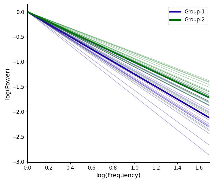
Plotting Aperiodic Fits
The plot_aperiodic_fits() function takes in
aperiodic parameters, and reconstructs aperiodic fits.
Here again we can plot visualizations of the peak parameters, and the reconstructed fits.
# Plot the aperiodic fits for Group 1
plot_aperiodic_fits(aps1, freq_range, control_offset=True)
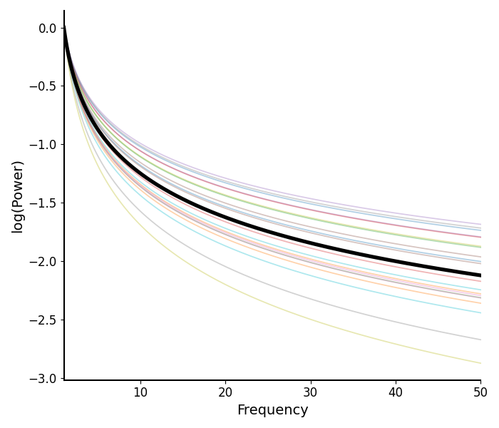
The plot_aperiodic_fits() also has some additional options
that can help to tune the visualization, including:
control_offset : whether the control for offset differences, by setting to zero
This can be useful to visualize if it’s the exponent specifically that is changing
log_freqs : whether to log the frequency values, on the x-axis
# Plot the aperiodic fits for both groups
plot_aperiodic_fits([aps1, aps2], freq_range,
                    control_offset=True, log_freqs=True,
                    labels=labels, colors=colors)
/Users/tom/opt/anaconda3/lib/python3.8/site-packages/fooof/plts/style.py:71: MatplotlibDeprecationWarning: The legendHandles attribute was deprecated in Matplotlib 3.7 and will be removed two minor releases later. Use legend_handles instead.
  for handle in legend.legendHandles:
/Users/tom/opt/anaconda3/lib/python3.8/site-packages/fooof/plts/style.py:71: MatplotlibDeprecationWarning: The legendHandles attribute was deprecated in Matplotlib 3.7 and will be removed two minor releases later. Use legend_handles instead.
  for handle in legend.legendHandles:
/Users/tom/opt/anaconda3/lib/python3.8/site-packages/fooof/plts/style.py:71: MatplotlibDeprecationWarning: The legendHandles attribute was deprecated in Matplotlib 3.7 and will be removed two minor releases later. Use legend_handles instead.
  for handle in legend.legendHandles:
Conclusions
In this example, we explored plotting model parameters and components within and between groups of parameterized neural power spectra.
If you check the simulation parameters used for the two groups, you can see that we set these groups to vary in their alpha center frequency and in the exponent value. Qualitatively, we can see those differences in the plots above, and this (in real data) would suggest there may be interesting differences between these groups. Follow up analyses in such a case could investigate whether there are statistically significant differences between these groups.
Total running time of the script: (0 minutes 1.498 seconds)