Note
Go to the end to download the full example code.
Plot Power Spectrum Models
Plotting power spectrum models, directly from FOOOF objects.
In order to the get a qualitative sense of if the model is fitting well, and what the results look like, it can be useful to visualize power spectrum model reconstructions.
This example dives deeper into plotting model reconstructions, using the
plot() method from a FOOOF object, and explores
options for tuning these these visualizations.
# Import matplotlib to help manage plotting
import matplotlib.pyplot as plt

# Import the FOOOF object
from fooof import FOOOF

# Import simulation functions to create some example data
from fooof.sim.gen import gen_power_spectrum
# Generate an example power spectrum
freqs, powers = gen_power_spectrum([3, 50], [1, 1],
                                   [[9, 0.25, 0.5], [22, 0.1, 1.5], [25, 0.2, 1.]])
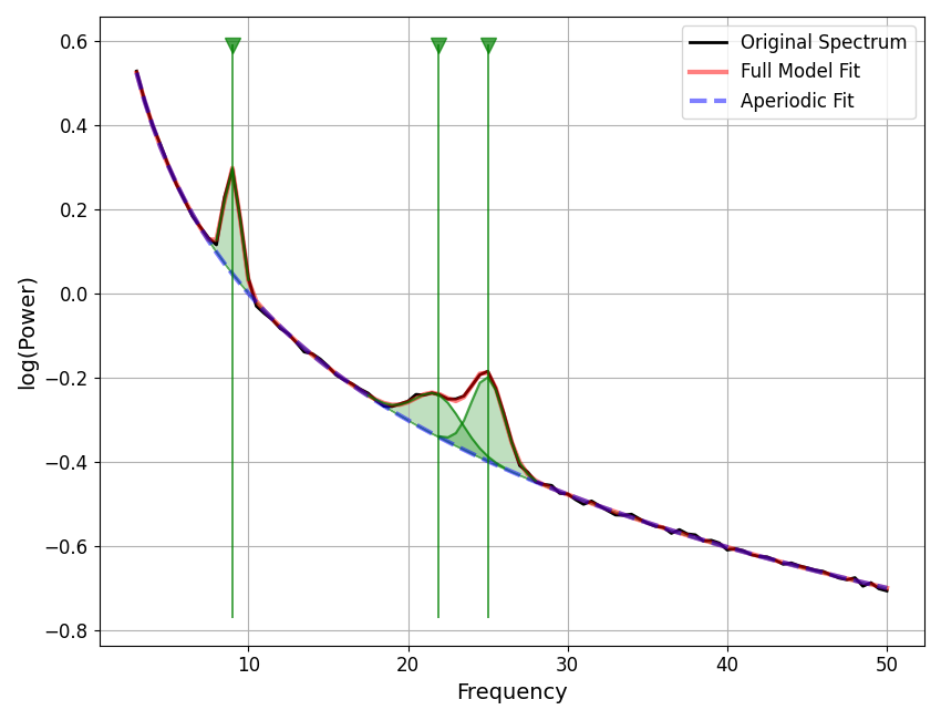
Plotting From FOOOF Objects
The FOOOF object has a plot() method that can be used to visualize
data and models available in the FOOOF object.
# Initialize a FOOOF object, and add some data to it
fm = FOOOF(verbose=False)
fm.add_data(freqs, powers)
Once you have added data to a FOOOF object, you can visualize the data using
plot().
# Plot the data available in the FOOOF object
fm.plot()
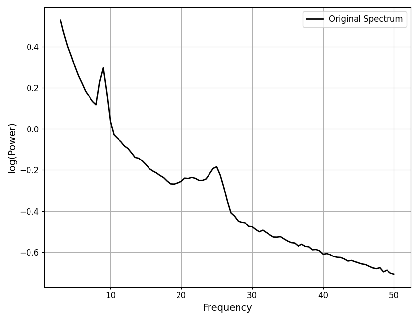
When the model is available, the plot() call also displays the
full model reconstruction, in red.
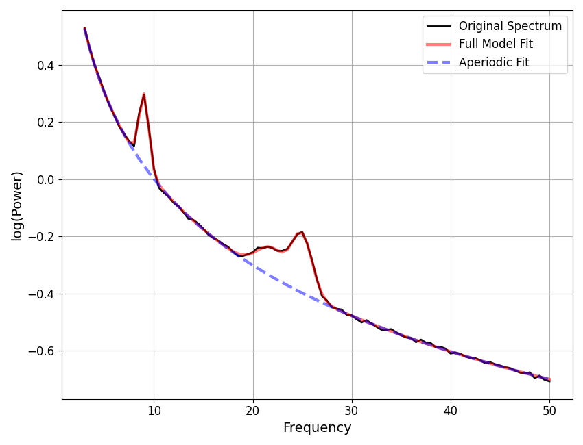
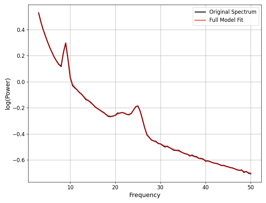
Plotting Aperiodic Components
As you can see above, the plot() call by default also plots the
aperiodic component, in a dashed blue line.
You can toggle whether to display the aperiodic component with the
plot_aperiodic parameter.
# Control whether to plot the aperiodic component
fm.plot(plot_aperiodic=False)
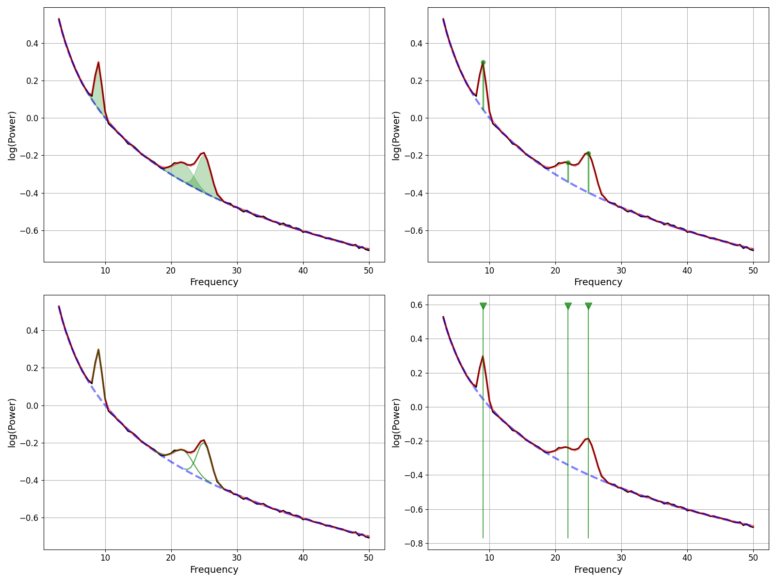
Plotting Periodic Components
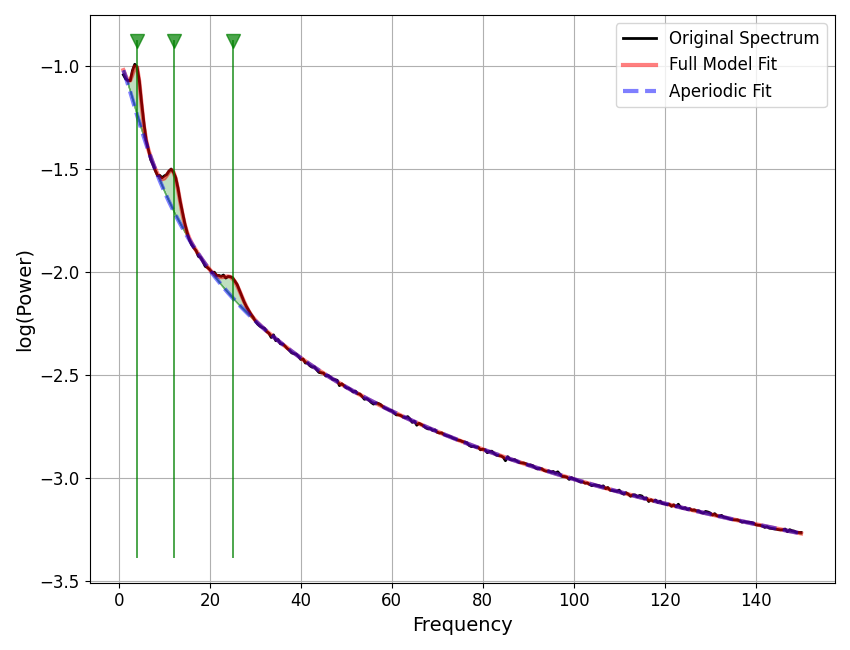
By default the peaks are only visualized as parts of the full model fit.
However, in some cases it can be useful to more explicitly visualize individual peaks, including where they are and if and how they overlap.
To do so, you can use the plot_peaks parameter, passing in a string specifier
of which approach you wish to use to visualize the peaks.
There are four options for visualizing peaks:
‘shade’ : shade in peaks
‘dot’ : add a line through the peak, with a dot at the top
‘outline’ : outline each peak
‘line’ : add a vertical line through the whole plot at peak locations
# Plotting Periodic Components
fig, axes = plt.subplots(2, 2, figsize=[16, 12])
peak_plots = ['shade', 'dot', 'outline', 'line']
for ax, peak_plot in zip(axes.flatten(), peak_plots):
    fm.plot(plot_peaks=peak_plot, add_legend=False, ax=ax)
Note that you can also combine different peak visualizations together.
This can be done by joining all requested peak visualization approaches, with dashes (-).
For example, as plot_peaks=’dot-outline-shade’.
# Combine peak representations
fm.plot(plot_aperiodic=True, plot_peaks='line-shade-outline', plt_log=False)
Which peak visualization is best depends on how you want to look at peaks, and what you want to check.
For example, for investigating possible peak overlaps, the outline approach may be the most useful. Or, across broader frequency ranges, it may be easier to visualize where peaks were fit with the full-length vertical lines.
# Simulate a new power spectrum, over a broader frequency region
freqs, powers = gen_power_spectrum([1, 150], [0, 10, 1.5],
                                   [[4, 0.25, 1], [12, 0.2, 1.5], [25, 0.1, 2]])
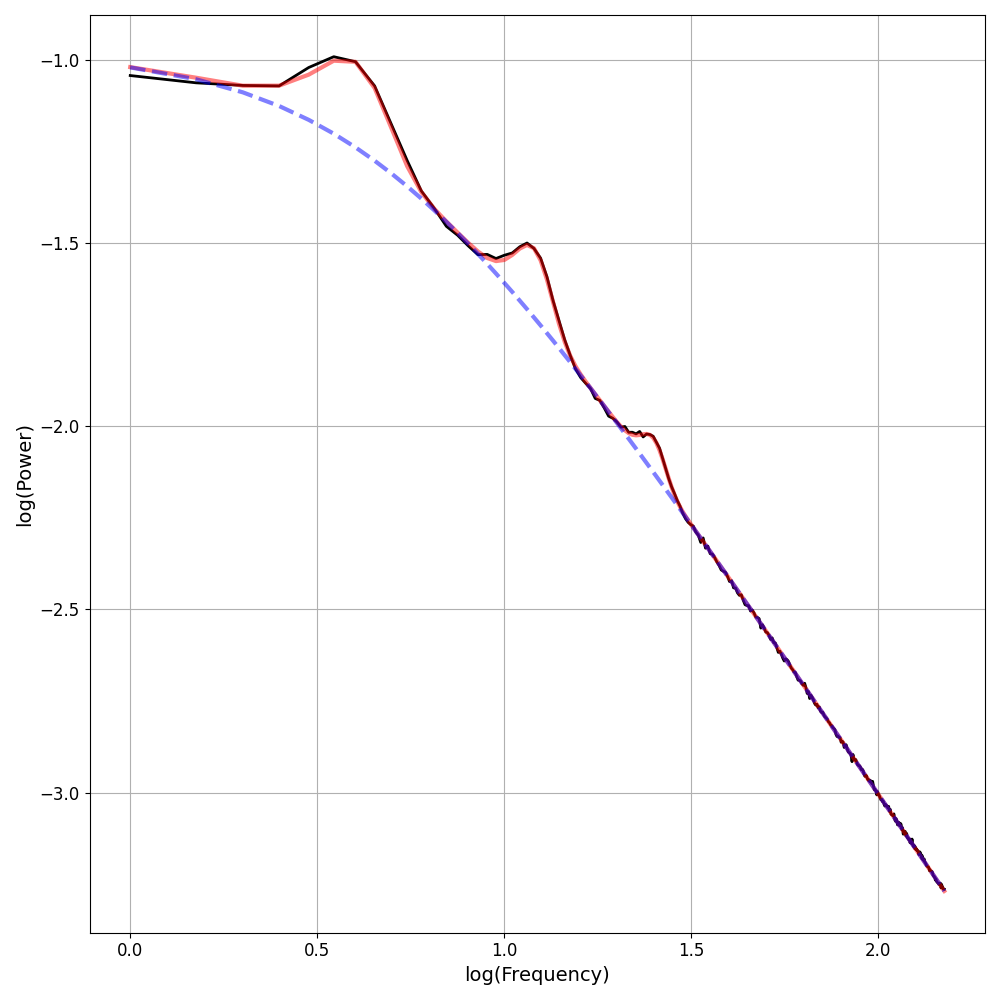
Other Plotting Options
There are also some other optional inputs to the plot() call, including:
plt_log : Optional input for plotting the frequency axis in log10 spacing
add_legend : Optional input to toggle whether to add a legend
save_fig : Optional input for whether to save out the figure
you can control the filename and where to save to with file_name and file_path
ax : Optional input to specify a matplotlib axes object to plot to
# Plot from FOOOF, using a custom axes with some optional inputs to tune the plot
_, ax = plt.subplots(figsize=[10, 10])
fm.plot(plt_log=True, add_legend=False, ax=ax)
Total running time of the script: (0 minutes 1.474 seconds)