Note
Go to the end to download the full example code.
Topographical Analyses with MNE
Parameterizing neural power spectra with MNE, doing a topographical analysis.
This tutorial requires that you have MNE installed. This tutorial needs mne >= 1.2.
If you don’t already have MNE, you can follow instructions to get it here.
For this example, we will explore how to parameterize power spectra using data loaded and managed with MNE, and how to plot topographies of resulting model parameters.
# General imports
import numpy as np
import matplotlib.pyplot as plt
from matplotlib import cm, colors, colorbar

# Import MNE, as well as the MNE sample dataset
import mne
from mne.datasets import sample

# FOOOF imports
from fooof import FOOOFGroup
from fooof.bands import Bands
from fooof.analysis import get_band_peak_fg
from fooof.plts.spectra import plot_spectra
/Users/tom/opt/anaconda3/lib/python3.8/site-packages/llvmlite/binding/ffi.py:175: DeprecationWarning: pkg_resources is deprecated as an API. See https://setuptools.pypa.io/en/latest/pkg_resources.html
  from pkg_resources import resource_filename
/Users/tom/opt/anaconda3/lib/python3.8/site-packages/pkg_resources/__init__.py:2871: DeprecationWarning: Deprecated call to `pkg_resources.declare_namespace('google')`.
Implementing implicit namespace packages (as specified in PEP 420) is preferred to `pkg_resources.declare_namespace`. See https://setuptools.pypa.io/en/latest/references/keywords.html#keyword-namespace-packages
  declare_namespace(pkg)
/Users/tom/opt/anaconda3/lib/python3.8/site-packages/pkg_resources/__init__.py:2871: DeprecationWarning: Deprecated call to `pkg_resources.declare_namespace('google.cloud')`.
Implementing implicit namespace packages (as specified in PEP 420) is preferred to `pkg_resources.declare_namespace`. See https://setuptools.pypa.io/en/latest/references/keywords.html#keyword-namespace-packages
  declare_namespace(pkg)
/Users/tom/opt/anaconda3/lib/python3.8/site-packages/pkg_resources/__init__.py:2350: DeprecationWarning: Deprecated call to `pkg_resources.declare_namespace('google')`.
Implementing implicit namespace packages (as specified in PEP 420) is preferred to `pkg_resources.declare_namespace`. See https://setuptools.pypa.io/en/latest/references/keywords.html#keyword-namespace-packages
  declare_namespace(parent)
/Users/tom/opt/anaconda3/lib/python3.8/site-packages/pkg_resources/__init__.py:2871: DeprecationWarning: Deprecated call to `pkg_resources.declare_namespace('google')`.
Implementing implicit namespace packages (as specified in PEP 420) is preferred to `pkg_resources.declare_namespace`. See https://setuptools.pypa.io/en/latest/references/keywords.html#keyword-namespace-packages
  declare_namespace(pkg)
/Users/tom/opt/anaconda3/lib/python3.8/site-packages/pkg_resources/__init__.py:2871: DeprecationWarning: Deprecated call to `pkg_resources.declare_namespace('google.cloud')`.
Implementing implicit namespace packages (as specified in PEP 420) is preferred to `pkg_resources.declare_namespace`. See https://setuptools.pypa.io/en/latest/references/keywords.html#keyword-namespace-packages
  declare_namespace(pkg)
/Users/tom/opt/anaconda3/lib/python3.8/site-packages/pkg_resources/__init__.py:2871: DeprecationWarning: Deprecated call to `pkg_resources.declare_namespace('google')`.
Implementing implicit namespace packages (as specified in PEP 420) is preferred to `pkg_resources.declare_namespace`. See https://setuptools.pypa.io/en/latest/references/keywords.html#keyword-namespace-packages
  declare_namespace(pkg)
/Users/tom/opt/anaconda3/lib/python3.8/site-packages/pkg_resources/__init__.py:2871: DeprecationWarning: Deprecated call to `pkg_resources.declare_namespace('google.logging')`.
Implementing implicit namespace packages (as specified in PEP 420) is preferred to `pkg_resources.declare_namespace`. See https://setuptools.pypa.io/en/latest/references/keywords.html#keyword-namespace-packages
  declare_namespace(pkg)
/Users/tom/opt/anaconda3/lib/python3.8/site-packages/pkg_resources/__init__.py:2350: DeprecationWarning: Deprecated call to `pkg_resources.declare_namespace('google')`.
Implementing implicit namespace packages (as specified in PEP 420) is preferred to `pkg_resources.declare_namespace`. See https://setuptools.pypa.io/en/latest/references/keywords.html#keyword-namespace-packages
  declare_namespace(parent)
/Users/tom/opt/anaconda3/lib/python3.8/site-packages/pkg_resources/__init__.py:2871: DeprecationWarning: Deprecated call to `pkg_resources.declare_namespace('mpl_toolkits')`.
Implementing implicit namespace packages (as specified in PEP 420) is preferred to `pkg_resources.declare_namespace`. See https://setuptools.pypa.io/en/latest/references/keywords.html#keyword-namespace-packages
  declare_namespace(pkg)
/Users/tom/opt/anaconda3/lib/python3.8/site-packages/pkg_resources/__init__.py:2871: DeprecationWarning: Deprecated call to `pkg_resources.declare_namespace('PyObjCTools')`.
Implementing implicit namespace packages (as specified in PEP 420) is preferred to `pkg_resources.declare_namespace`. See https://setuptools.pypa.io/en/latest/references/keywords.html#keyword-namespace-packages
  declare_namespace(pkg)
/Users/tom/opt/anaconda3/lib/python3.8/site-packages/pkg_resources/__init__.py:2871: DeprecationWarning: Deprecated call to `pkg_resources.declare_namespace('ruamel')`.
Implementing implicit namespace packages (as specified in PEP 420) is preferred to `pkg_resources.declare_namespace`. See https://setuptools.pypa.io/en/latest/references/keywords.html#keyword-namespace-packages
  declare_namespace(pkg)
/Users/tom/opt/anaconda3/lib/python3.8/site-packages/pkg_resources/__init__.py:2871: DeprecationWarning: Deprecated call to `pkg_resources.declare_namespace('sphinxcontrib')`.
Implementing implicit namespace packages (as specified in PEP 420) is preferred to `pkg_resources.declare_namespace`. See https://setuptools.pypa.io/en/latest/references/keywords.html#keyword-namespace-packages
  declare_namespace(pkg)
/Users/tom/opt/anaconda3/lib/python3.8/site-packages/pkg_resources/__init__.py:2871: DeprecationWarning: Deprecated call to `pkg_resources.declare_namespace('zope')`.
Implementing implicit namespace packages (as specified in PEP 420) is preferred to `pkg_resources.declare_namespace`. See https://setuptools.pypa.io/en/latest/references/keywords.html#keyword-namespace-packages
  declare_namespace(pkg)
Load & Check MNE Data
We will use the MNE sample dataset which is a combined MEG/EEG recording with an audiovisual task.
First we will load the dataset from MNE, have a quick look at the data, and extract the EEG data that we will use for this example.
Note that if you are running this locally, the following cell will download the example dataset, if you do not already have it.
# Get the data path for the MNE example data
raw_fname = sample.data_path() / 'MEG' / 'sample' / 'sample_audvis_filt-0-40_raw.fif'

# Load the example MNE data
raw = mne.io.read_raw_fif(raw_fname, preload=True, verbose=False)
# Select EEG channels from the dataset
raw = raw.pick(['eeg'], exclude='bads')
Removing projector <Projection | PCA-v1, active : False, n_channels : 102>
Removing projector <Projection | PCA-v2, active : False, n_channels : 102>
Removing projector <Projection | PCA-v3, active : False, n_channels : 102>
# Set the reference to be average reference
raw = raw.set_eeg_reference()
EEG channel type selected for re-referencing
Applying average reference.
Applying a custom ('EEG',) reference.
Removing existing average EEG reference projection.
Dealing with NaN Values
One thing to keep in mind when parameterizing power spectra, and extracting bands of interest, is that there is no guarantee that the model will detect peaks in any given range.
We consider this a pro, since power spectrum model is able to adjudicate whether there is evidence of oscillatory power within a given band, but it does also mean that sometimes results for a given band can be NaN, which doesn’t always work very well with further analyses that we may want to do.
To be able to deal with nan-values, we will define a helper function to check for NaN values and apply a specified policy for how to deal with them.
def check_nans(data, nan_policy='zero'):
    """Check an array for nan values, and replace, based on policy."""

    # Find where there are nan values in the data
    nan_inds = np.where(np.isnan(data))

    # Apply desired nan policy to data
    if nan_policy == 'zero':
        data[nan_inds] = 0
    elif nan_policy == 'mean':
        data[nan_inds] = np.nanmean(data)
    else:
        raise ValueError('Nan policy not understood.')

    return data
Calculating Power Spectra
To fit power spectrum models, we need to convert the time-series data we have loaded in frequency representations - meaning we have to calculate power spectra.
To do so, we will leverage the time frequency tools available with MNE,
in the time_frequency module. In particular, we can use the compute_psd
method, that takes in MNE data objects and calculates and returns power spectra.
# Calculate power spectra across the continuous data
psd = raw.compute_psd(method="welch", fmin=1, fmax=40, tmin=0, tmax=250,
                      n_overlap=150, n_fft=300)
spectra, freqs = psd.get_data(return_freqs=True)
Effective window size : 1.998 (s)
Fitting Power Spectrum Models
Now that we have power spectra, we can fit some power spectrum models.
Since we have multiple power spectra, we will use the FOOOFGroup object.
# Initialize a FOOOFGroup object, with desired settings
fg = FOOOFGroup(peak_width_limits=[1, 6], min_peak_height=0.15,
                peak_threshold=2., max_n_peaks=6, verbose=False)

# Define the frequency range to fit
freq_range = [1, 30]
# Fit the power spectrum model across all channels
fg.fit(freqs, spectra, freq_range)
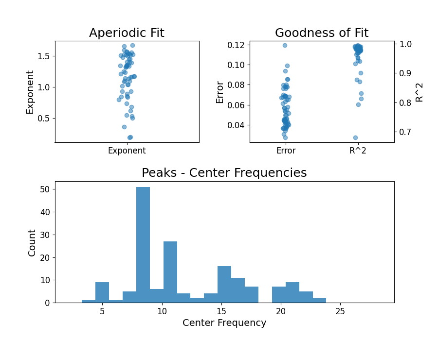
# Check the overall results of the group fits
fg.plot()
Plotting Topographies
Now that we have our power spectrum models calculated across all channels, let’s start by plotting topographies of some of the resulting model parameters.
To do so, we can leverage the fact that both MNE and FOOOF objects preserve data order.
So, when we calculated power spectra, our output spectra kept the channel order
that is described in the MNE data object, and so did our FOOOFGroup
object.
That means that to plot our topography, we can use the MNE plot_topomap
function, passing in extracted data for power spectrum parameters per channel, and
using the MNE object to define the corresponding channel locations.
Plotting Periodic Topographies
Lets start start by plotting some periodic model parameters.
To do so, we will use to Bands object to manage some band
definitions, and some analysis utilities to extracts peaks from bands of interest.
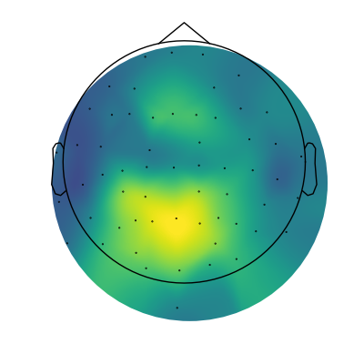
# Extract alpha peaks
alphas = get_band_peak_fg(fg, bands.alpha)

# Extract the power values from the detected peaks
alpha_pw = alphas[:, 1]
# Plot the topography of alpha power
mne.viz.plot_topomap(alpha_pw, raw.info, cmap=cm.viridis, contours=0, size=4)
(<matplotlib.image.AxesImage object at 0x7fe3765dd070>, None)
And there we have it, our first topography of parameterized spectra, showing alpha power!
The topography makes sense, as we can see a centro-posterior distribution.
Now we can extend this to plot the power of each of our other defined frequency bands.
# Plot the topographies across different frequency bands
fig, axes = plt.subplots(1, 3, figsize=(15, 5))
for ind, (label, band_def) in enumerate(bands):

    # Get the power values across channels for the current band
    band_power = check_nans(get_band_peak_fg(fg, band_def)[:, 1])

    # Create a topomap for the current oscillation band
    mne.viz.plot_topomap(band_power, raw.info, cmap=cm.viridis, contours=0, axes=axes[ind])

    # Set the plot title
    axes[ind].set_title(label + ' power', {'fontsize' : 20})
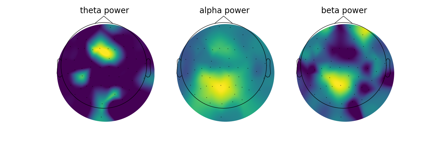
You might notice that the topographies of some of the bands look a little ‘patchy’. This is because we are setting any channels for which we did not find a peak as zero with our check_nan approach. Note this is also a single subject analysis.
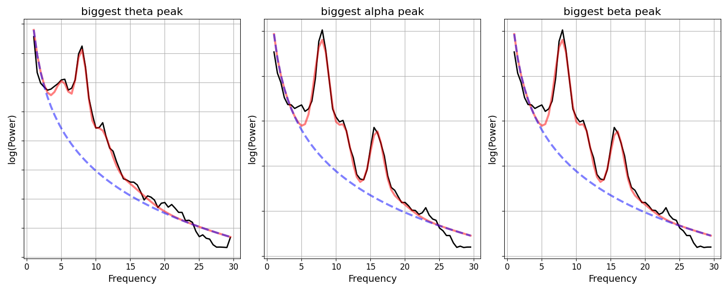
Since we have the power spectrum models for each of our channels, we can also explore what these peaks look like in the underlying power spectra.
Next, lets check the power spectra for the largest detected peaks within each band.
fig, axes = plt.subplots(1, 3, figsize=(15, 6))
for ind, (label, band_def) in enumerate(bands):

    # Get the power values across channels for the current band
    band_power = check_nans(get_band_peak_fg(fg, band_def)[:, 1])

    # Extracted and plot the power spectrum model with the most band power
    fg.get_fooof(np.argmax(band_power)).plot(ax=axes[ind], add_legend=False)

    # Set some plot aesthetics & plot title
    axes[ind].yaxis.set_ticklabels([])
    axes[ind].set_title('biggest ' + label + ' peak', {'fontsize' : 16})
Plotting Aperiodic Topographies
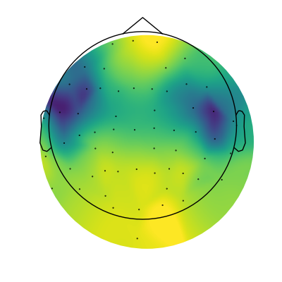
Next up, let’s plot the topography of the aperiodic exponent.
To do so, we can simply extract the aperiodic parameters from our power spectrum models, and plot them.
# Extract aperiodic exponent values
exps = fg.get_params('aperiodic_params', 'exponent')
# Plot the topography of aperiodic exponents
mne.viz.plot_topomap(exps, raw.info, cmap=cm.viridis, contours=0, size=4)
(<matplotlib.image.AxesImage object at 0x7fe36c2a8100>, None)
In the topography above, we can see that there is a fair amount of variation across the scalp in terms of aperiodic exponent value, and there seems to be some spatial structure to it.
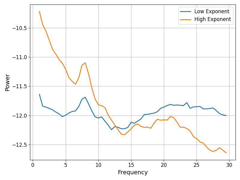
To visualize how much the exponent values vary, we can again plot some example power spectra, in this case extracting those with the highest and lower exponent values.
# Compare the power spectra between low and high exponent channels
fig, ax = plt.subplots(figsize=(8, 6))

spectra = [fg.get_fooof(np.argmin(exps)).power_spectrum,
           fg.get_fooof(np.argmax(exps)).power_spectrum]

plot_spectra(fg.freqs, spectra, ax=ax, labels=['Low Exponent', 'High Exponent'])
Conclusion
In this example, we have seen how to apply power spectrum models to data that is managed and processed with MNE.
Total running time of the script: (0 minutes 4.168 seconds)